← Thinking About DesignVision Walls: An Analog tool for End-to-End JourneysWhen I was at Electronic Arts Worldwide Studios, I was often brought in to put out fires, which essentially meant troubleshooting projects that had derailed or lost their focus. (Fun Fact: This was where my consultancy’s name Engine Co 4 came from.) Regardless of what the executive team told me the cause was, my first step was always simple: interview people across the floor and ask them simply, “In 3 sentences or less, what game are you making?” Then: how do you know that, and how do you know whether your work is on target for it? Equally, how do you track your user journeys at both the micro and macro levels? Regardless of the studio or game, when a game was in trouble, one cause was universally consistent: the lack of a single shared vision of what they were building. In teams larger than five people, it would be exceptionally rare to find three people who shared the exact same vision for the product’s scope, mechanics, capabilities, and flow. Disconnects between where the art was going and where the gameplay systems were heading were rarely intentional but were the natural consequence of non-visible designs. In the days of PC and console game development, such a vision would likely have been described ad nauseam in a Game Design Document (GDD) covering hundreds of pages. Similar to a PhD thesis, these documents were likely read by the author and maybe a handful of people, but never an entire team. Worse, when design changes did happen, they were contained in the lead designer’s brain or isolated Jira tickets. With few people seeing the changes documented, the broader impact on the game went unnoticed. The Miro Trap: Why Infinite Digital Canvases Fail
Digital whiteboards are excellent tools for virtual brainstorming for many teams, and I use them often for working with remote clients. However, for team members to regularly see end-to-end or complex design documents and quickly read changes or understand iterations, the virtual tool falls short. These infinite digital canvases prioritize ease of modification (granted, they let you scroll back in time through versions like a code repository), which creates its own form of cognitive friction. This is in addition to revisions being obscured behind zoom levels, pans, layers, and browser tabs, and, most importantly, requiring a user to log in and check regularly. Unless an organization keeps an active projector running 24/7 on an open studio floor, digital boards are out of sight and out of mind. The virtual tool falls short nearly every time.
When I was hands-on leading design or art teams, our physical Vision Wall became the de facto reality check and would always become the beating heart of a design team. Because a physical wall cannot be minimized, closed, or scrolled away, it brings physical scale and gravitas with persistent visibility. Any executive, engineer, producer/program manager, investor, or new hire can walk into a room and rapidly digest the full scope, trajectory, and current maturity of an interactive ecosystem. It shifts project alignment from an act of faith into an observable, shared physical reality. A Tool for any Interactive ProjectWhen I made the transition from games and film back to designing apps and services, I found the same problems kept arising. Curiously, it was here that programmers found it even more useful than in games, as they were not as used to thinking about memory and architecture constraints. I have since used this same method on apps for mental health, physician practice management, medical AI tools, and even a tourism matchmaking app.
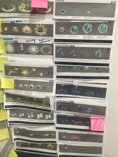
The Physical Canvas: Adapting from Feature AnimationThrough my involvement with ACM SIGGRAPH and my role at EA, I had the good fortune of developing relationships with creative leaders at Disney Feature Animation and DreamWorks Animation. As we shared methods, I learned about the power of a color script, story graphs, storyboards, and animatics. Similarly, I came to appreciate more how animation studios quickly take those animatics and put them up on reels, as in film reels. Animatics are essentially a stop-frame animated version of a video or movie that uses storyboards, typically low fidelity and hand-drawn, where each storyboard is on screen for the approximate length of time the shot it represents would be on screen. They will typically include music and sound effects. The essential notion is that if a film isn’t funny, or the story isn't good on the reels (starting with the animatic), adding more color, light, and animation isn’t likely to fix the core story problems, therefore do not pass go, do not start increasing the cost of production. Storyboards are quick and inexpensive to make, but if production starts before things are clear, it smells a lot like what tech people call “tech debt,” which is like quicksand. Once you are in, it gets harder and harder to escape, let alone do your best work. The more I saw game teams adrift, the more I thought games, and interaction design more broadly, needed a better way to do pre-production and keep the team aligned, the way reels were incredibly powerful at keeping animation teams of hundreds aligned and focused. And that brought me back to the step before animatics: those moving, portable 4’ x 8’ Homasote walls on wheels at Disney. Their story teams mapped nearly their entire show across rolling pin-up boards, much like what Stanford’s d.school later popularized. Story rooms across film and television had long figured this out: pinning the entire narrative arc onto a wall so the whole team could see the story from start to finish. It struck me as bizarre that linear storytelling mediums relied on this physical wisdom, while interactive mediums, which are vastly more complex, did not. Interactive products may not be linear, but they still have a beginning, an end, and a defined, prioritized user progression. Designers know the branches, rules, constraints, and decision trees, but those relationships are rarely surfaced so everyone can examine them at once. To solve this, I developed the Vision Wall, a method of full-ecosystem Experience Mapping. Find a place to stand shoulder to shoulder, looking at and discussing a wall rather than eye to eye. It's a subtle method for unifying the team around the work, not against each other. The Core Philosophy: A Living Document, Not a ShowroomBefore detailing how a wall is constructed, one foundational rule must be understood: Many teams want to make these walls pretty. Those walls have the least value. A Vision Wall, whether stationary or moving, is not marketing collateral for a studio lobby. It is a living, working physical document that layers up to communicate the current status of the creative vision, continuity, and scope to an entire team. The wall starts with Post-it notes describing the beat, event, or mechanic that is placed in the timeline. Images or swipes1 from a swipe file2, reference art, and screen grabs on top of the Post-it notes. Then loose concept sketches or storyboards, followed by low-res art. As designs change, the new one goes on top of the old one. Ideally, note or mark up the old one so people can quickly understand why a concept was iterated on or discarded. Iteration is keyThe best work requires multiple iterations to visualize, prototype, and explore design ideas. This can and should happen much more frequently and quickly at the start of pre-production
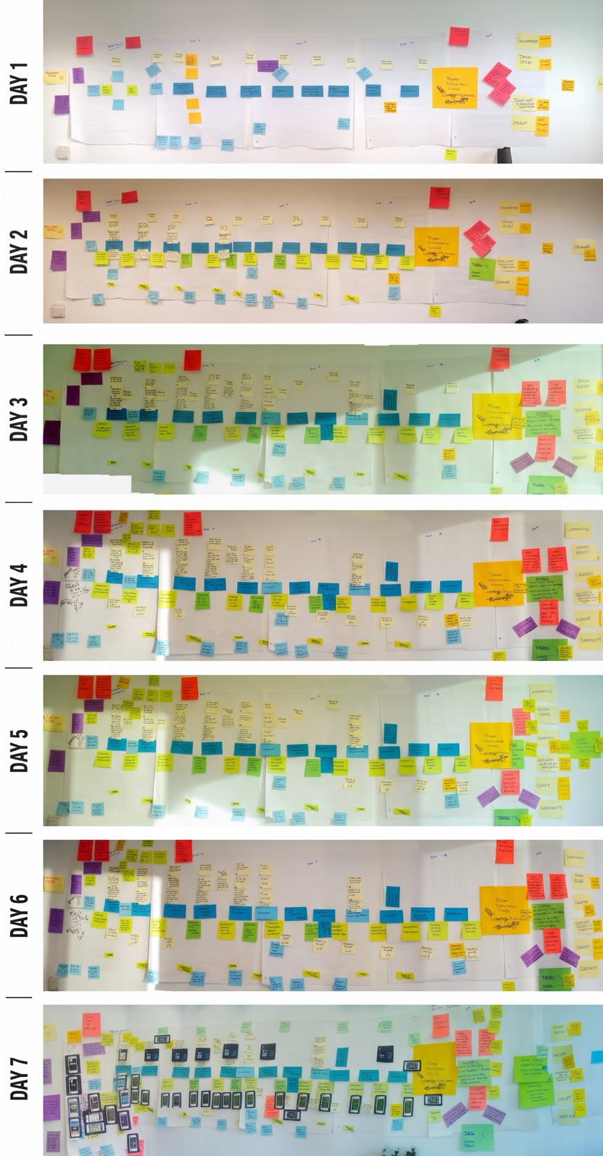 Visual Architecture of the WallA Vision Wall takes the largest continuous wall in a studio and establishes a spatial layout for the entire interactive experience. Based on production architectures developed across console and digital ecosystems, the wall is organized into distinct horizontal bands and vertical milestones. You might wonder why time is represented on a linear timeline, especially when interactive apps and games' primary goal is to give users agency. When we consider user journeys, from discovery (the first moment someone hears about the project), to download/install it (their first interaction with the product, that is typically escapes design attention), and how they progress thereafter through Nue User Experience ("NUE" and ramp to the goal of conversion, these stages must be thoughtfully designed to prevent users from failing while building confidence in the first week. Therefore, it's critical to leverage all your design elements, such as incentives, narrative, and audio and visual media, to hook your user. Every tool at your disposal should help guide, influence, and support players along the way. While some pathways may branch out and become more complex, we want to visualize for the entire team how we want to bring players in, build their confidence, and encourage them to continue their journey. 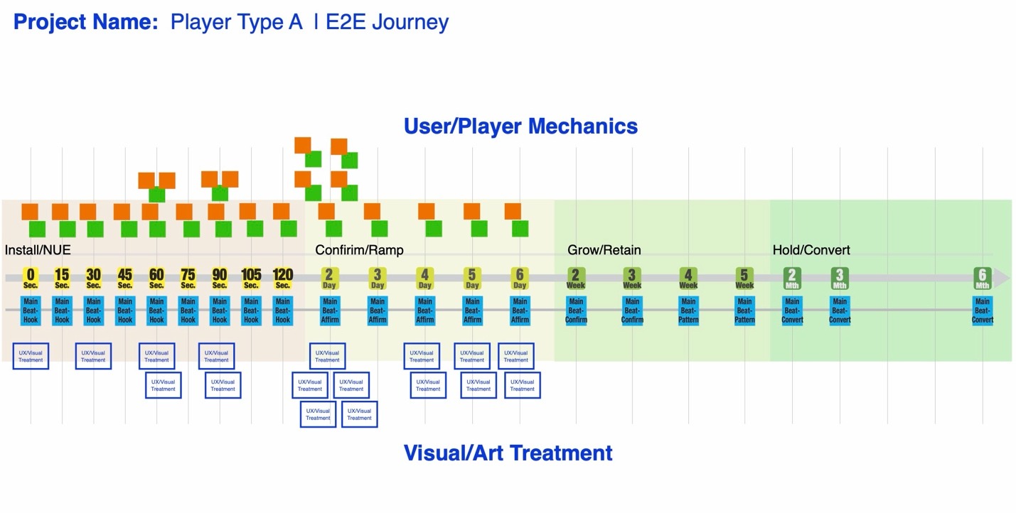
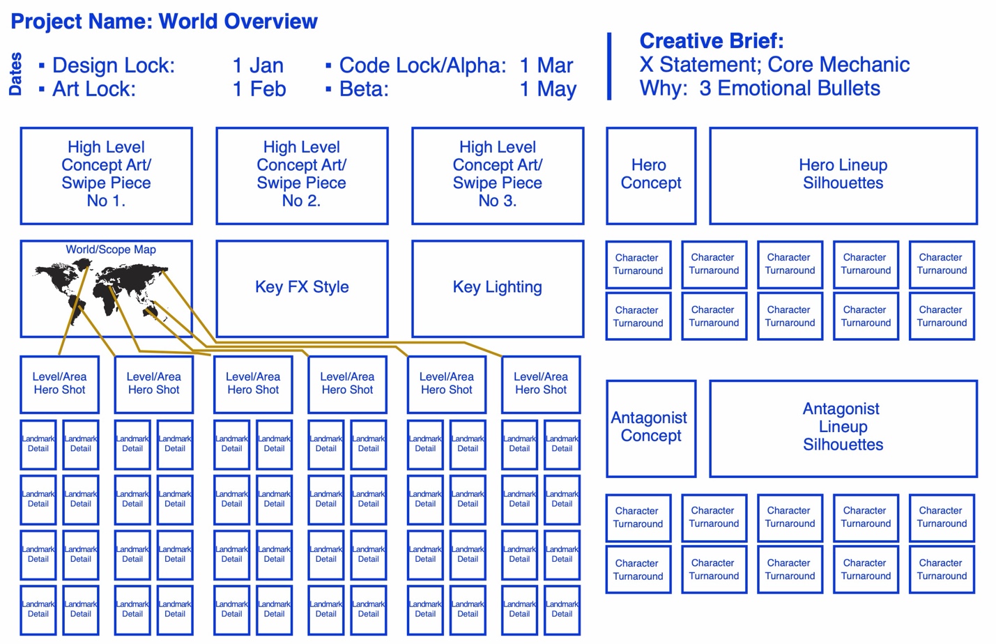 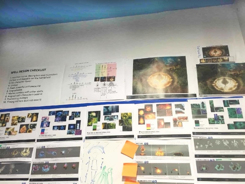
For games, more ‘robust’ apps, or apps that deal with the physical world, more pictures or illustrations are essential. An overview of the world you are building, whether literal or figurative, is indispensable. If it’s a game, the characters, weapons, and key environments all need their place so you can ensure you have the right contrast. If it’s an app, the digital environment, with its clear fences, areas, and boundaries, is essential to keep everyone honest. As I have started using this method for mental health apps, reminding our team where the users are at different times in their day is equally helpful.
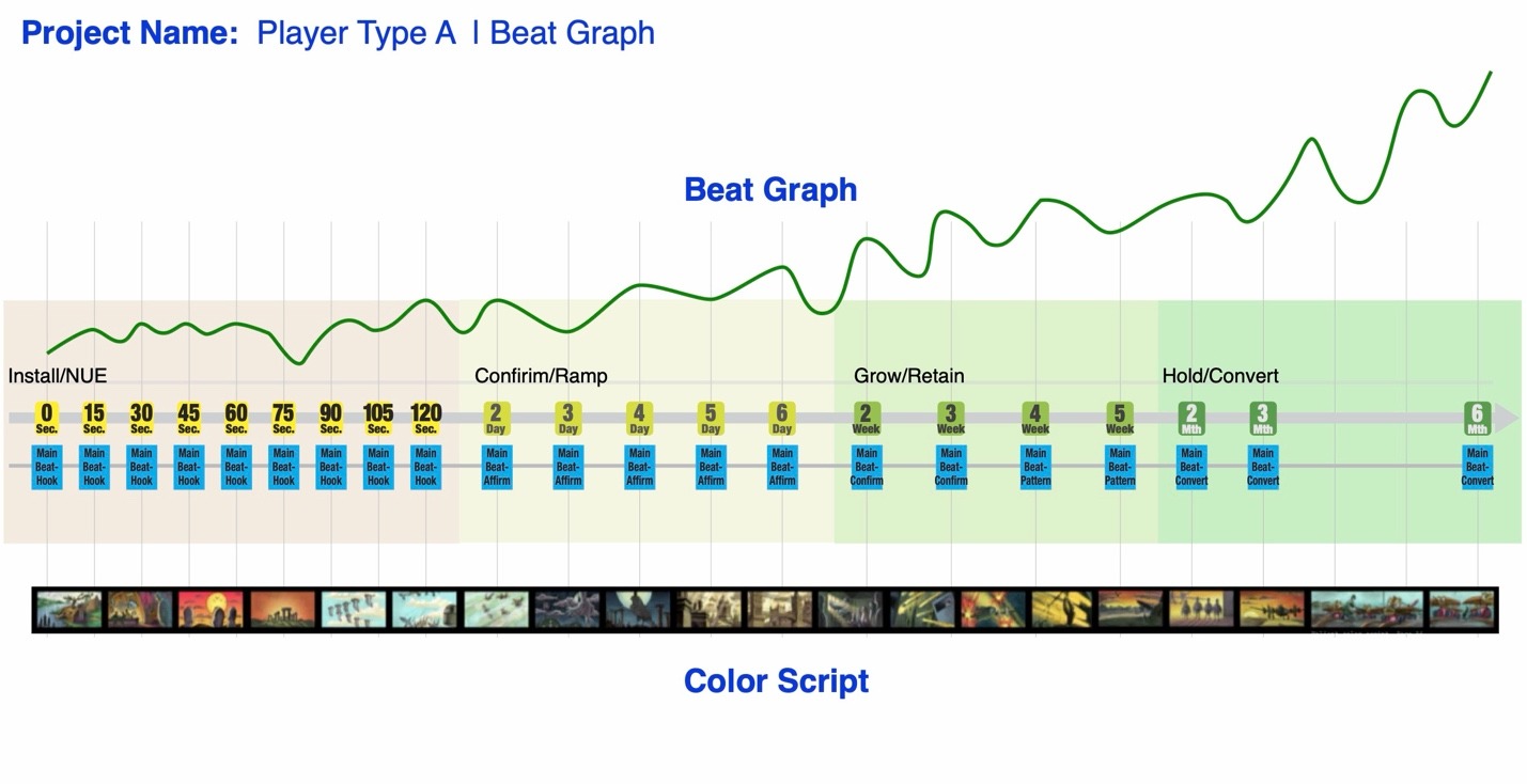 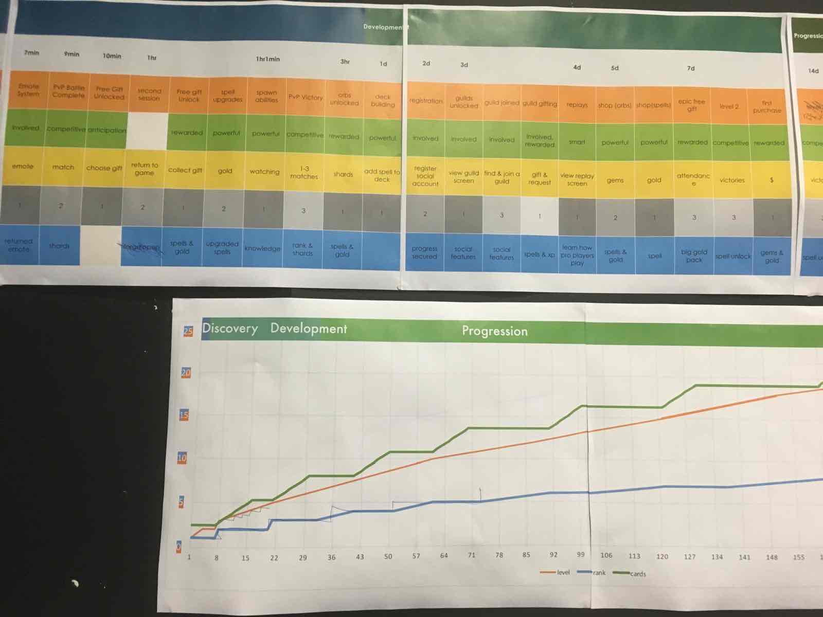
Ground Rules for SuccessA wall's value to the team depends on the recency and accuracy of its content, meaning what is actually approved rather than pending. To ensure that, I rely on these core principles;
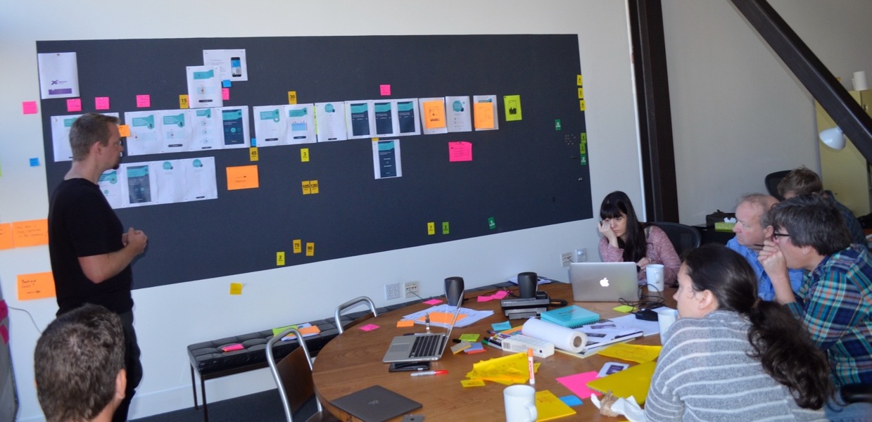
Using it in Practice/Preventing Design Creep: 3-QuestionsThe Vision Wall functions as an instant operational check against scope creep. Whenever a designer, engineer, or executive pitches a new feature, the conversation is conducted standing at the wall:
If the person pitching can’t point to the explicit entry, exit, and lifecycle frequency on the wall, the feature is almost certainly unnecessary weight. Equally, the wall is useful for working out transitions in and out of each level, state, new feature, etc. Beyond the Screen: Transmedia & Omnichannel MappingIn larger IPs, the belt line extends beyond the console or PC experience into full Experience Mapping. Rather than treating external platforms (mobile companion apps, web portals, social community drops, licensed merchandise) as fragmented marketing afterthoughts, they are pinned directly to the time axis:
When mapped along a single physical plane, marketing, design, and live-ops align around a single cohesive rhythm rather than disjointed, platform-specific sprints. Making Your Own Rolling WallsThe Disney versions were known as rolling storyboards or sequence carts. The version Stanford d. School created is a z-rack and they published a guide for building your own here. The version we built before the dSchool was in existence was rather simple, using ½” steel pipes with pipe brackets on the top and sides that held a 4’ x 8’ sheet of Celotex or Homasote wallboard, wrapped in inexpensive linen. This was then bolted on to a 2”x6” plank with 4 casters. We later moved the casters to a set of perpendicular outriggers to increase stability. |